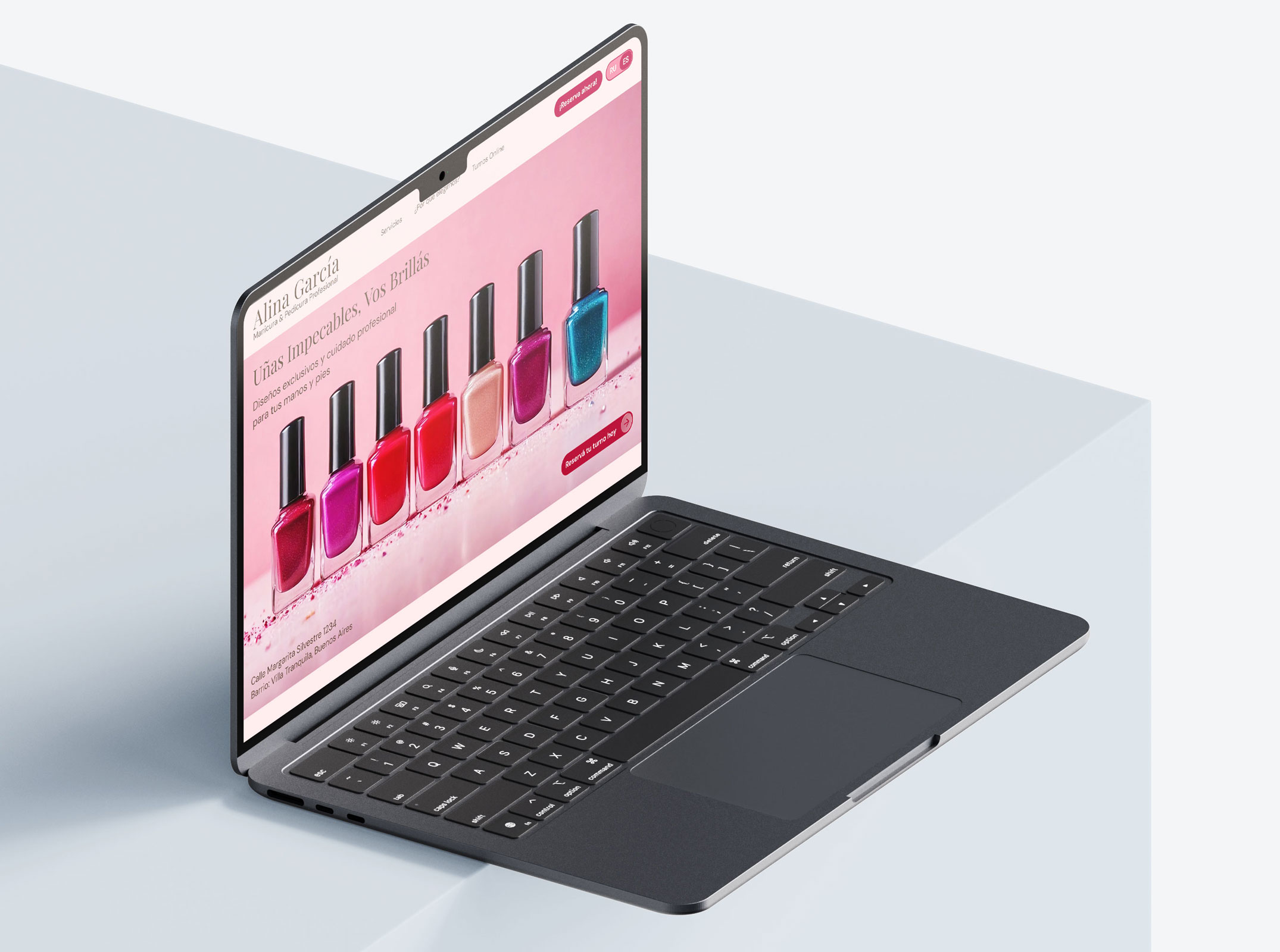
Bilingual Website for a Nail Care Specialist
Fully bilingual website implementation for an Argentinean small business owner.
Fully bilingual website implementation for an Argentinean small business owner.
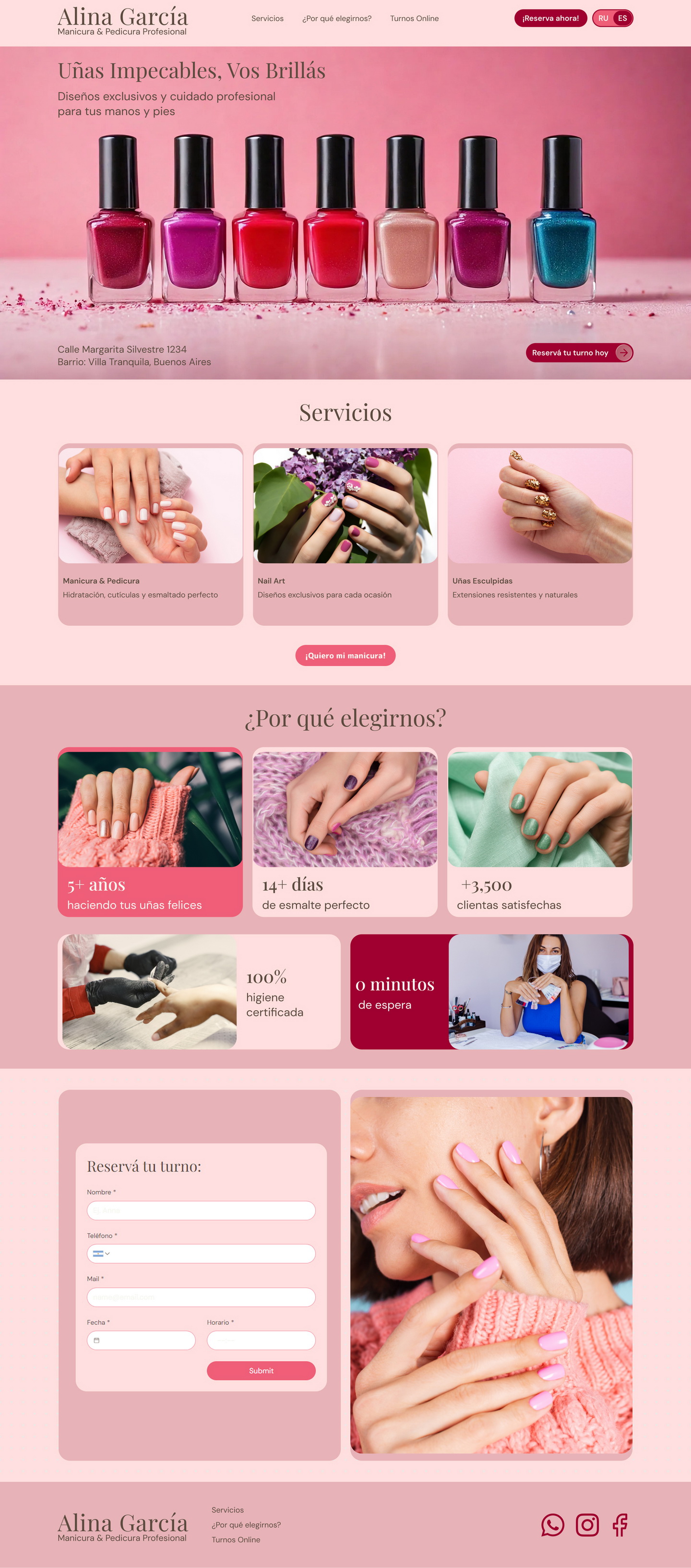

We designed a bilingual landing page for a Nail Care Specialist in Argentina
Tell us how you see your future website, and we'll clarify the path forward.